
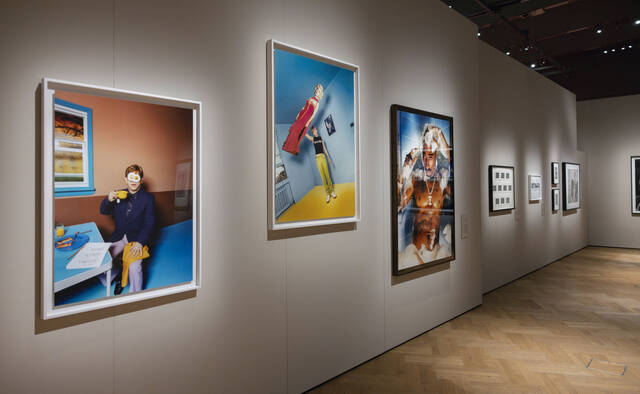
Good exhibits don’t just happen. They’re built — deliberately, with real attention to who’s walking through the door and why. Museum display, gallery installation, temporary pop-up — the format is almost beside the point. Did visitors leave feeling something? That’s the question. The strongest exhibits reach past objects on pedestals and pull people into a story, spark genuine curiosity, maybe even shift how someone thinks about a subject entirely. Sensory. Connected. Human. Anything short of that is just furniture in a room.
Understanding Your Audience and Setting Clear Goals
Do this before a single display gets sketched out. Who’s actually showing up? A family wrestling two restless kids through on a Saturday behaves nothing like a graduate researcher or an industry professional. Content, language, even font size — it all shifts depending on who you’re designing for. Pin that down first. Then ask what you want visitors walking away with. Specific knowledge? Aesthetic appreciation? A push toward some kind of action? These aren’t soft, optional questions. Clear goals drive every downstream decision — layout, lighting, which materials earn their spot. Miss this step and even a gorgeous space turns hollow. It ends up lecturing at people instead of pulling them in.
Designing Space and Flow for Engagement
Physical layout does more work than most people realize. Sight lines, foot traffic patterns, the intuitive pull of a well-placed focal point — these shape the experience before visitors read a single word. Entry and exit should feel obvious. Dead ends frustrate people; confusing signage frustrates them more. Vary display heights. Keep things dynamic so the eye has somewhere to travel. Lighting deserves serious thought — a dramatic spot can elevate one piece above everything else in the room, while warmer ambient light signals “slow down, linger here.” The whole spatial arrangement should feel intentional rather than just full. Give visitors room to stop and actually absorb something.
Using Interactive and Sensory Elements Effectively
Touchscreens, hands-on specimens, audio environments, video loops, contribution walls — modern exhibits aren’t exactly short on interactive tools. Used well, they deepen engagement and reach visitors with different learning styles. A natural history display that lets people handle real specimens, or pipes in recorded soundscapes from the field, lands completely differently than one that just posts text panels. Sensory input activates more of the brain. But here’s the catch: interactivity for its own sake backfires. Novelty wears off fast. Every interactive element should reinforce your core message — not pull focus away from it. A poorly integrated touchscreen is just a shiny distraction, nothing more.
Crafting Clear and Compelling Narratives
Every exhibit worth remembering has a spine — a central story or theme connecting individual pieces into something coherent. Without it, you’ve got a collection. With it, you’ve got an experience. That narrative might move chronologically, probe a complicated issue from several angles, or surface surprising links between objects that seem totally unrelated at first glance. When exhibitors need to present a brand story or product line in a compact footprint, a high-quality tradeshow booth enables professionals to apply these same narrative principles within a defined space, ensuring every visual and interactive element supports a unified message. Text panels and labels should be tight — no jargon unless the audience genuinely expects it. Visual hierarchy does the heavy lifting, steering attention without overwhelming. When the narrative lands, visitors leave with clarity. Some even feel the urge to dig deeper on their own.
Evaluating and Refining Your Exhibit
Opening day isn’t the finish line. Watch what visitors actually do — which zones hold them longest, which interactive elements get ignored, where people look confused or disengaged. Surveys and comment cards add another layer. So does staff feedback. Floor staff hear the same questions on repeat; they’re the first to notice which labels stop people cold with confusion and which displays consistently draw a crowd. That’s valuable intelligence. Use it. Adjust signage. Rethink lighting. Pull elements that aren’t earning their place. An exhibit that never gets refined slowly loses its edge — and visitors notice, even when they can’t say exactly why.
Conclusion
Memorable exhibits don’t come from a single brilliant idea. They’re built by layering audience understanding, smart spatial design, purposeful interactivity, and a narrative that actually holds together. Each piece shapes the others. Clarity and creativity have to coexist; structure needs to leave room for flexibility. And the work doesn’t stop at launch — it continues as long as people are walking through the door. When everything aligns, the exhibit stops being a room full of things. It becomes something visitors carry with them long after they leave.